Themes
Visual themes for the desktop app. Ships with several built-ins; custom themes can be installed from the marketplace or written yourself.
Built-in themes
- Dark (default)
- Light
- High contrast
- Solarized dark / light
- Dracula
- Monokai
Switch in Settings → Appearance → Theme.
Follow system
Auto follows your OS light/dark preference. Switches automatically when your system changes.
Installing a custom theme
Browse Settings → Marketplace → Themes. Click install. The theme appears in your theme picker.
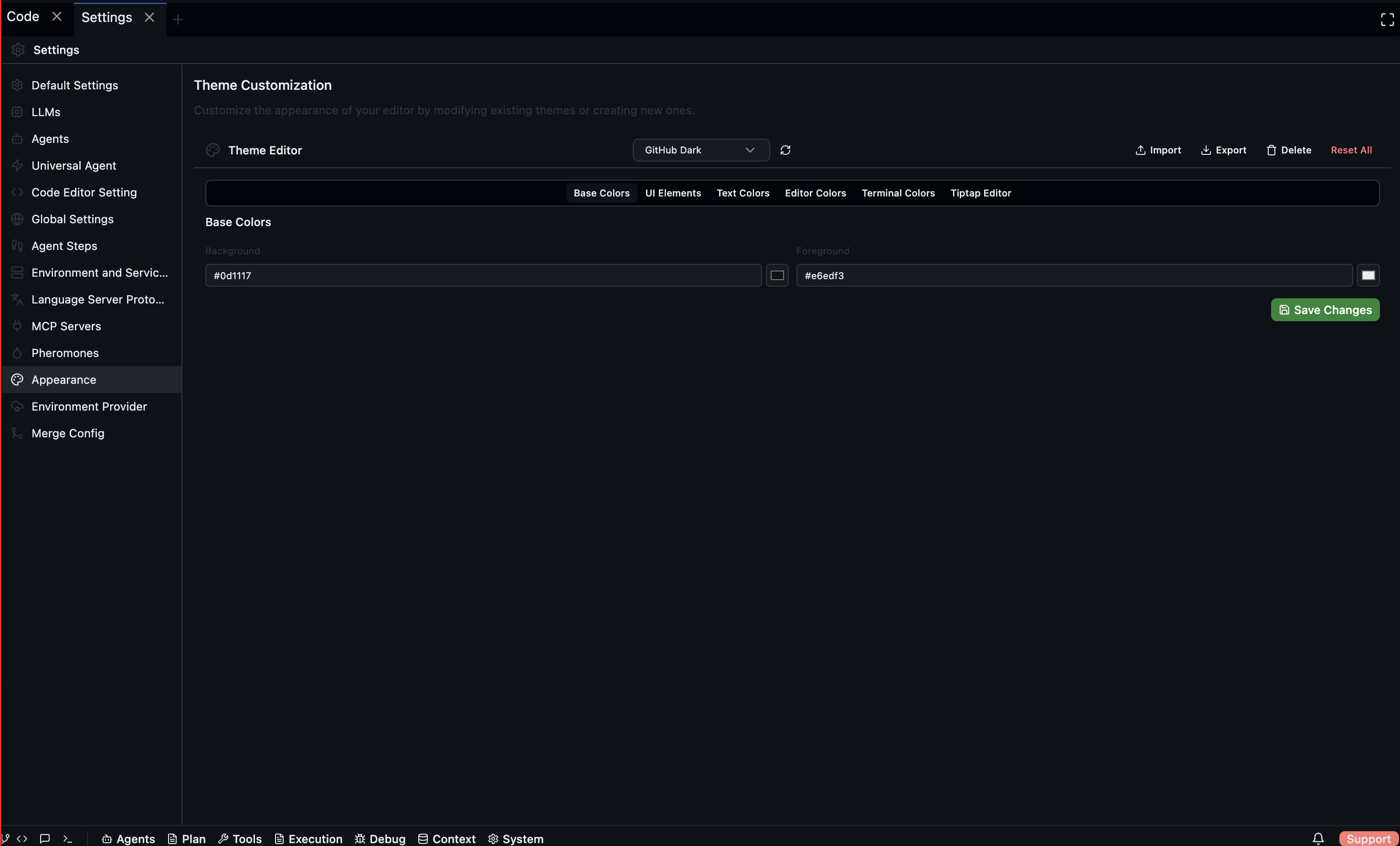
Theme Editor
The built-in Theme Editor lets you customise every colour in the UI. Select a base theme to start from, then adjust Base Colors, UI Elements, Text Colors, Editor Colors, Terminal Colors, and Tiptap Editor styles. You can also import, export, and delete custom themes.
Writing a theme
A theme is a JSON file with colour and style variables:
{
  "name": "my-theme",
  "type": "dark",
  "colors": {
    "editor.background": "#1a1a2e",
    "editor.foreground": "#eaeaea",
    "activityBar.background": "#0f0f1e",
    "sideBar.background": "#16162a",
    "tab.activeBackground": "#242442",
    "statusBar.background": "#0a0a1a",
    "chat.userMessage.background": "#2a2a4a",
    "chat.assistantMessage.background": "#1a1a2e"
  },
  "tokenColors": [
    { "scope": "comment", "settings": { "foreground": "#7a7a9a" } },
    { "scope": "string", "settings": { "foreground": "#a5d6a7" } },
    { "scope": "keyword", "settings": { "foreground": "#ce93d8" } }
  ]
}
Save under ~/.codebolt/themes/my-theme.json — it appears in the picker immediately.
Colour variable reference
The full list of variables is under Reference → Theme schema. Codebolt uses a VS Code-compatible subset plus chat-specific extensions.
Publishing a theme
Themes publish to the marketplace the same way agents do:
codebolt theme publish ./my-theme.json
Requires a theme.yaml manifest with name, version, author, and optional screenshots.